Portfolio
About
Blog
Recents posts
Categories
AI.
Animation
Architecture
Branding & Identity
Calligraphy
Colour
Craftmanship
Creative
Data Visualisation
Design Approach
Fashion
Graphic Design
Graffiti
Print Design
Nature
Product Design
Science
Sound
Street Art
Theatre
Title Sequences
Typeface
Typography
Visual Language
Web design
Say hello!
All Typography posts
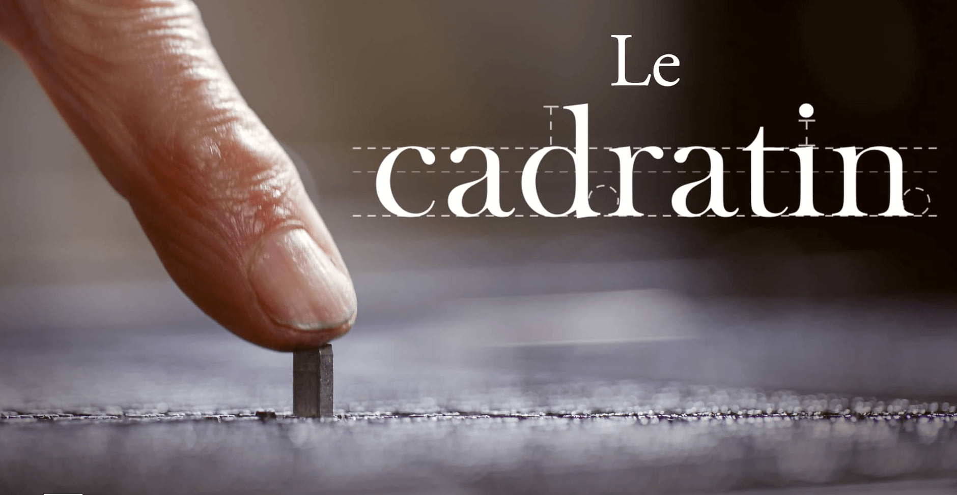
Documentary Le Cadratin (The Em Space) directed by Arthur Choupin
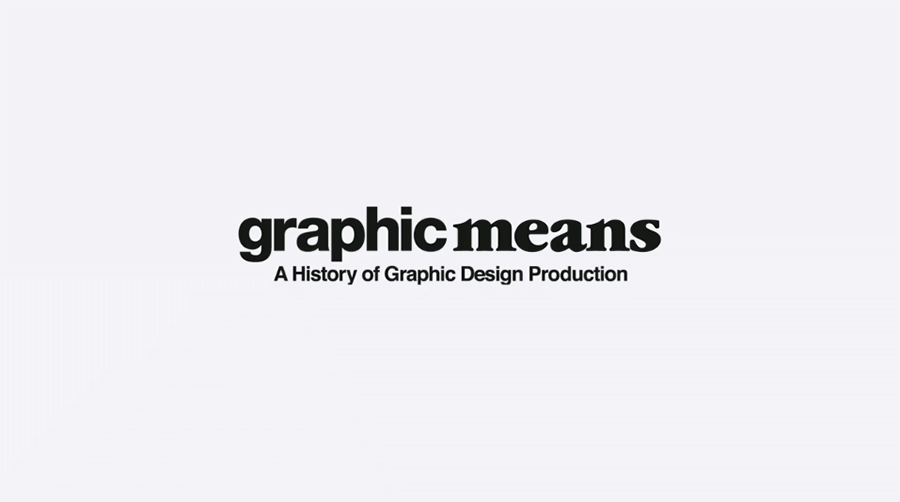
Graphic Means (Official Trailer)
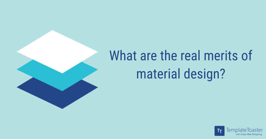
What are the real merits of material design?
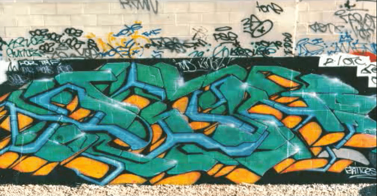
5 Graffiti and Street Art Documentaries to Watch Online
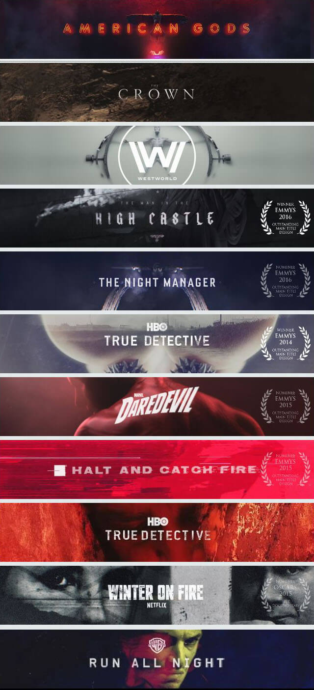
Patrick Clair, resident creative director at Elastic
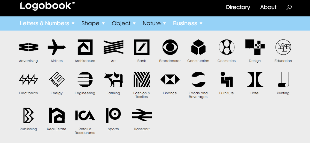
New website Logobook archives logos going back to the ’50s
Piece by Piece (2005, Original Trailer)
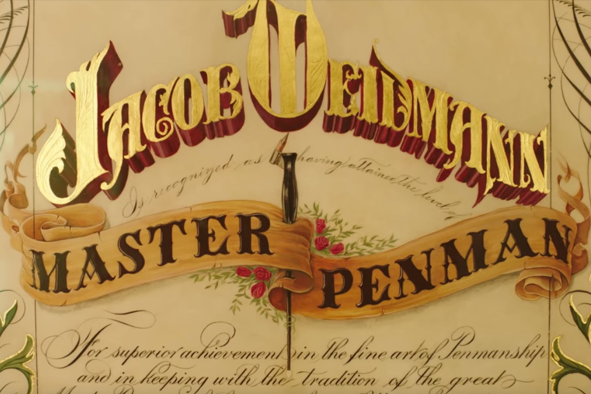
Master Penman Jake Weidmann
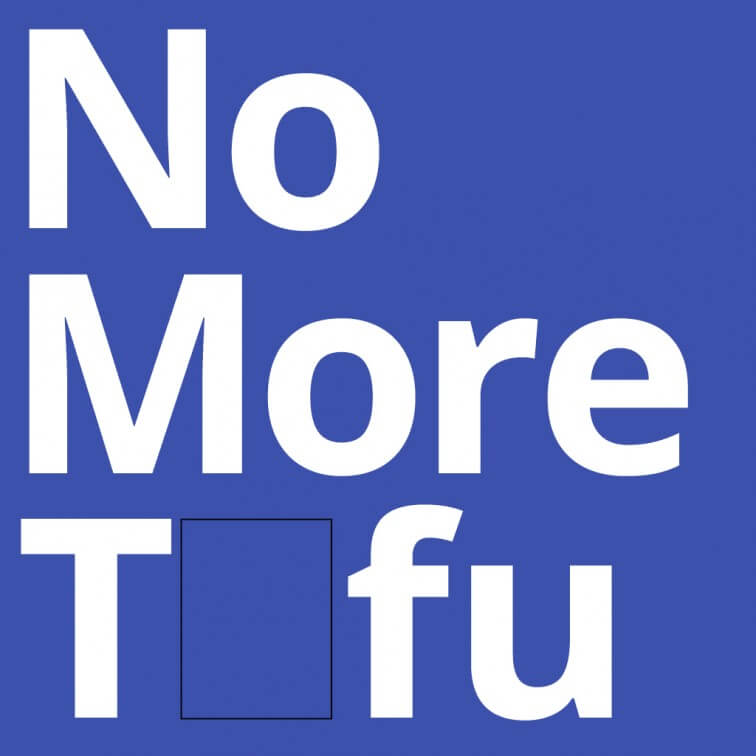
NOTO | Monotype + Google.
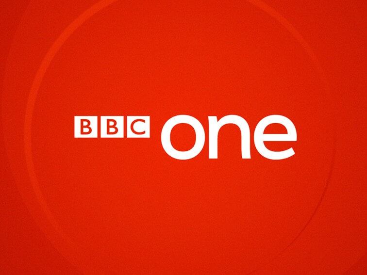
BBC One – Fontsmith.