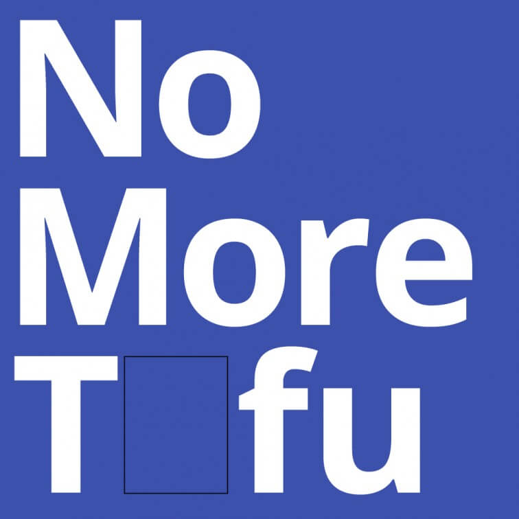
NOTO | Monotype + Google.
- by R27
- in Blog Typography Visual Language
- posted January 4, 2017
Noto typeface family helps enable global communications across devices, borders, cultures, languages and periods of time. The term “Noto” conveys the idea that Google’s goal is to see “no more tofu,” with tofu referring...
Read More
A simple and effective hob design solution.
- by R27
- in Blog Product Design
- posted January 3, 2017
You know… Problem solving’s actually the easy bit. Problem finding is incredibly tough. Honestly that’s what design is really about. Finding the right problem to solve. The 55° MirrorHob seems like a...
Read MoreIdentity – Longsands Fish Kitchen.
- by R27
- in Blog Branding & Identity
- posted January 3, 2017
Simple and creative identity for – Longsands Fish Kitchen by Ross Pichler Have a look and smile a little… see more at Rosspichler.co.uk Save Save Save
Read More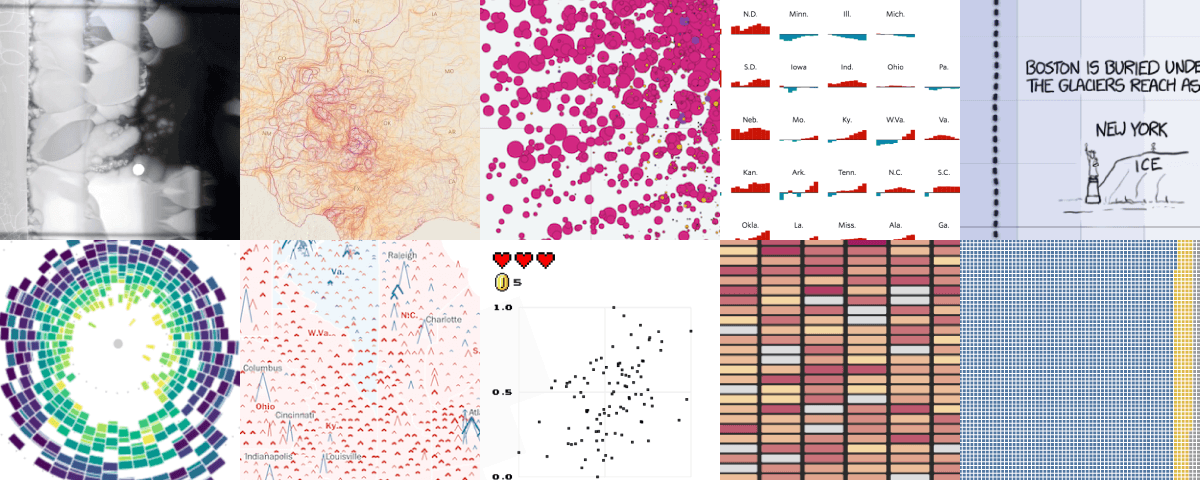
Best Data Visualization Projects of 2016.
- by R27
- in Blog Data Visualisation
- posted January 2, 2017
Visualization continues its merging into the everyday — less standalone and more of a medium that blends with words. I think this is partially because of a concentration on mobile. There’s simply...
Read More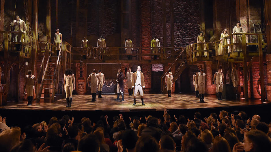
Visualizing the Words from “Hamilton”.
- by R27
- in Blog Data Visualisation Theatre
- posted December 31, 2016
Shirley Wu distills the immensely popular (and immensely complex) musical into a single interactive. Even though the hit musical Hamilton opened on Broadway a year and a half...
Read More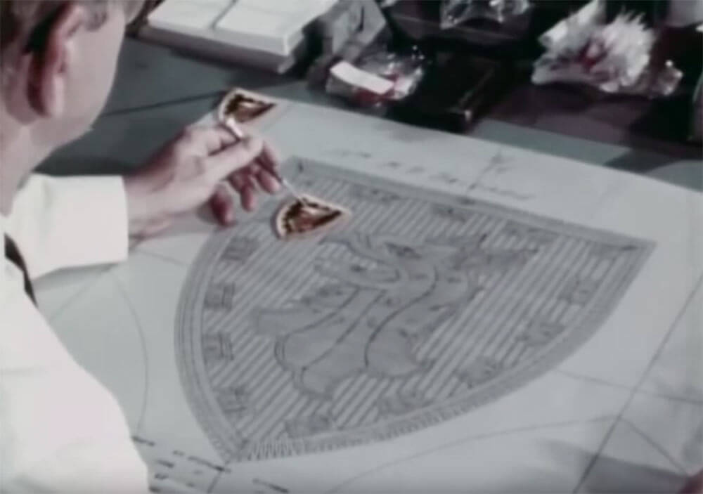
The Institute of Heraldry, 1969.
- by R27
- in Blog Branding & Identity Craftmanship
- posted December 15, 2016
“Here, a group of specialists with unique training, skills, and experience will, on request, design and develop a wide variety of heraldic devices for official agencies of the Federal Government. Coats...
Read More
BBC One – Fontsmith.
- by R27
- in Blog Branding & Identity Typeface Typography
- posted December 14, 2016
The challenge was designing a unique logotype and typeface that would appeal to such a diverse audience and still convey the traditional BBC One image, but with an element of freshness in...
Read More